Ugly on Purpose: How Early Internet Chaos Became Gen Z's Most Honest Design Statement
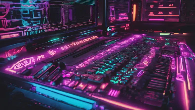
Photo: colorful Y2K retro computer screen aesthetic neon design, via s.widget-club.com
There's a Tumblr-era joke that never really got old: "I didn't choose the aesthetic, the aesthetic chose me." Swap Tumblr for TikTok and the aesthetic in question for something louder, messier, and genuinely kind of hard to look at, and you've got a pretty accurate description of where digital design is living in 2024.
Y2K maximalism — that sprawling visual language of clashing fonts, animated GIFs, hot pink gradients, and layouts that seem structurally opposed to white space — is everywhere. And it's not a glitch. It's a choice.
What We Mean When We Say Y2K
Let's get specific, because "Y2K" gets thrown around loosely enough that it's started to mean almost everything and almost nothing at the same time. We're not just talking about low-rise jeans and butterfly clips, though sure, those are part of the cultural package. In the design context, Y2K maximalism refers to the visual grammar of the early internet: circa 1998–2006 web aesthetics, the kind that emerged before UX designers existed as a professional class and before Apple convinced the world that restraint was a virtue.
Think GeoCities homepages with tiled backgrounds. Think early Flash animations. Think every color in the hex spectrum used simultaneously, with full confidence. Text that spins. Cursors that trail sparkles. The general vibe that whoever built this page had seventeen ideas at once and wasn't going to let a single one go.
For a lot of Gen Z creators — people who were toddlers when these sites were live — this isn't nostalgia in the traditional sense. You can't really be nostalgic for something you didn't experience firsthand. What they're tapping into is something closer to inherited memory, a visual mythology of an internet that felt ungoverned, personal, and gloriously impractical.
Minimalism Had It Coming
To understand why maximalism is winning, you have to understand what it's pushing back against.
For roughly a decade — let's call it 2010 to 2022 — minimalism was the unquestioned king of digital design. Clean sans-serif fonts. Lots of white space. Muted palettes. The kind of aesthetic that looked great in a pitch deck and felt, after a while, like every website had been designed by the same very competent, very beige robot.
Apple set the template. Squarespace democratized it. Instagram enforced it. And slowly, almost imperceptibly, the visual internet started to look like one long, tasteful hotel lobby.
The problem with hotel lobbies is that nobody actually lives in them.
Gen Z creators noticed. And rather than tweak the formula, they blew it up. Discord servers dedicated to "indie web" revival have been growing steadily, with communities sharing hand-coded HTML pages, custom cursors, and guestbooks — actual guestbooks — as acts of creative resistance. Platforms like Neocities, essentially a spiritual successor to GeoCities, have seen a surge in new users since 2020, many of them teenagers building personal web pages that look nothing like anything an algorithm would recommend.
The Authenticity Angle
Here's where it gets genuinely interesting from a cultural standpoint: maximalism in 2024 isn't just an aesthetic preference. It's functioning as a signal of authenticity.
In an era when AI can generate a polished, minimalist brand identity in about forty-five seconds, "looking professional" has lost some of its currency. Anyone can produce clean. Clean is easy now. What's harder — and therefore more meaningful to a generation that grew up watching influencer culture manufacture itself in real time — is looking deliberately imperfect.
The chaos of Y2K design carries a kind of proof of work. It says: a human made this, a human who had opinions and didn't consult a mood board. The visual noise is the message. It's saying, I was here, and I had feelings about it, and I used Comic Sans.
Creators on TikTok have built entire followings around this ethos. Graphic designers posting their work with overlapping textures, chromatic aberration, and pixel art elements routinely outperform sleeker, more "professional" content. The comments sections are full of people saying some version of "this feels real" — which is a strange thing to say about a digital artifact, but it makes sense when you think about what they're comparing it to.
The Cycle and What It Tells Us
Design historians will tell you that aesthetic cycles tend to run about twenty to twenty-five years — long enough for something to feel dated, then long enough for it to feel retro, then long enough for it to feel fresh again to people who didn't live through the first wave. Y2K aesthetics are right on schedule.
But there's something different about this particular revival. Earlier aesthetic cycles — think '70s nostalgia in the '90s, or '80s nostalgia in the 2000s — were largely driven by the entertainment industry, by TV shows and movies deliberately evoking a past era. What's happening now is bottom-up. It's individual creators, small collectives, Discord communities, and indie developers reconstructing an aesthetic from scratch because it speaks to something they're feeling right now.
What they're feeling, if you spend any time in these spaces, is something like: the internet got too corporate, too smooth, too optimized for engagement metrics and advertiser comfort. The chaos of early web design wasn't a bug — it was proof that the internet once belonged to regular people who just wanted to make something weird.
Where This Goes Next
The honest answer is that no aesthetic lasts forever, and maximalism will eventually peak and recede. Some version of minimalism will come back around, probably rebranded as something like "intentional simplicity" or "digital calm," and it'll feel fresh again because enough time will have passed.
But right now, in 2024, the blinking text is winning. The neon gradients are winning. The layouts that look like they were designed by someone who just discovered layers for the first time are winning.
And honestly? It's kind of a relief. The internet is more interesting when it looks like people live in it.